more photos, this time from a temple
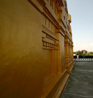
the first shot is the stupa taked with a ultrawide angle directly at the corner. I was trying to achieve the effect of putting the subject right smack in your face. In a sense to show the massiveness of the structure and inject some element of power in it.

the second shot is more of my standard shot of structure against the sky. i tend to have an afinity to shoot with the structure pointed offcenter to project the impression of strength and power. Somehow it feels like the structure is putting a foot on you and looking down at you. i find that a very intimidating pose and that helps in infusing the power element into it.somehow i find it hard to inject the power element if i were to shoot it directly under the structure and have it pointed straight up. My other reason for shooting at an angle is to maximise the blueness of the sky. Some test shots of shooting directly up (even with F22) aperature did not resulted in blue enough sky.
For the 3rd shot, i tried to put into perspective the size of the stupa. Obviously i exaggerated it by a bit but it makes an interesting perspective. The timing was also made to position Mrs Chien at the corner. This is done to as to put a subject into the shot. My logic is this. the natural lines of the stupa in this shot seem to point to one spot where she is standing. Having her there serves 2 purpose. 1. as mentioned earlier, putting a subject to the shot and 2. to put a perspective of the size of the stupa. Having a human figure there makes the audience get a picture of the comparative size of the object.
4th shot are some closeup. actually they are not really closeup. Ther are 'harvested' from a wider shot. when i was sorting out the shots i noticed that i have missed out on one very important aspect of the stupa. within the cavities, there are small buddha statues. I have totally missed out on the close up shots. This shot is just to illustrate the detail portion of the structure. All too often we get hung up on the size and the massiveness of the strycture and go for the widest angle lens to capture everything, but one must not forget that there are little gems to be had if one were to zoom in closer for the details. that is definately one lesson that i will remember for the next shoot.
The ironic thing about photography is that never underestimate yourself and a photo opportunity when you see one. When we got to this place, the lighting was absolutely horrendous. Another thing was that the first level of the wat was totally covered and if one did not go up to the higher level one would not have known the magnificent stupa is there. These 3 shots are from my intial wanderings around the first level.The first level was actuallycovered with zinc roof. To let light in , certain parts of the roof was coveret with the translucent sheet.I guess as time goes by, the translucent tiles start to lose color and resultes in a greenish tint. I find the pattern very intriguing as it is not typical of Thai Wats. looks more like Hindu temple kind of design.
For this shot i tried to capitalize on the lighting created by the roof. The greenish tint of light actually did not do a good job in hilighting the patterns around the 1st level. This is because the patterns are painted in bright red and yellow. Anyway in any case, i tried to tackle this shot by going for a more conservative focal length (~30 mm) on same level instead of wide from a dramatic angle. The reason is that i wanna reduce the distortion on the intricate patterns. Distortion ould have killed the nbeauty of the patterns. On the other hand i did not go to too long mainly because i do not want to flatten the pattern, but most importantly i wannt capture the light from the roof. I really like this shot mainly because the darkness and greenish tint evokes a feeling of coolness and quietness (which is the feeling that i had when i was there) but the coolness was contrasted by the bright red and yellow pattern. The yellow and red pattern sort of evoke a feeling of heat that is deep inside. sort of like a slow burning fire that is deep seeded somewhere inside. In a way it kind of represent my intrepetation of the food and culture in Thailand, very cool, calm and soothing, but when you go deeper you will see the firey hot spirit.(akin to their food)
This is a shot that i myseld am still struggling if i should like it or not. what i did was to try to frame the stupa outside with the window. I also used the rows of pillars to lead the viewer's attention to the window. What i tried to do was to try to evoke the sense of religious / cultural identity. there is also a play of contrast at work here. Cool inside (dark/greenish) and hot (bright/yellow) outside, Stupa (Thai Buddhist influence) and Pillars (Hindu influence). Actually i took 2 shots. one with the human figure and one without. I chose the one with the figure to inject some human feel to the geometric shapes. In the end i am torn on this. still have not decided if it worked or not.
This is another part of the hallway. very similar to the pattern in pohoto. but this one has a small cup on it. For this shot i went closer and shot, then photoshopped it to increase the contrast and convert to BW using channel mixer. Why this shot work for me? the inclusion of the cup as a focal point. sometimes when I engcounter beautiful patterns, i am at odds as to how to capture them. Sometimes too much pattern becomes noise and screws up the shot. The cup seres ad a focak point for the viewer to focus on, instead of getting lost in the patterns. But why BW? i think just for the heck of it. The lighting is good for BW, so why not. should have shot it using my contax though.... so, in all these 3 shot are mostly reminds me of contrast. It is really hard fopr me to explain, but you have just got to be there to know how i feel. On one hand it is a hot day outside, but it is really cool at that first level. what initially thought wwas a bust for photography turned out to be a good yeilding trip. not to mention a Hindu influenced Wat!
Here are are two shots from outside the Wat. These are taken with slides.
this is the head of one of the two large statue outside the wat. The interesting thing here is that the statues are actually quite big (abt 2 -3 storeys high). They are uite magnificent actually, but to go for a wide angle and capture the whole statue will only make the shot lost. I think it's a case of not putting everything into one shot and confusing the viewer with all the details. So i chose to just to capture the head and limit the details shown. this keeps the shot simple and not so confusing to the viewer.
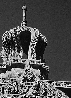
Shot 2&3. This is a shot of the roof of an altar outside of the temple. Again the same concept of limiting the details is employed. But i am torn between keeping it as a colored shot or a BW shot. In color (Shot 2) i like the way the red and yellow contrast with the blue sky. Unfortunately, the scanned result has a slightly different tint and the contrast seems to have wear off a bit.In the BW shot (actually the same shot as shot 2 converted with channel mixer) (shot 3), i think it works better for me as the shot looks cleaner and not as confusing. Your thoughts? Shot 2 or shot 3?


0 Comments:
Post a Comment
<< Home